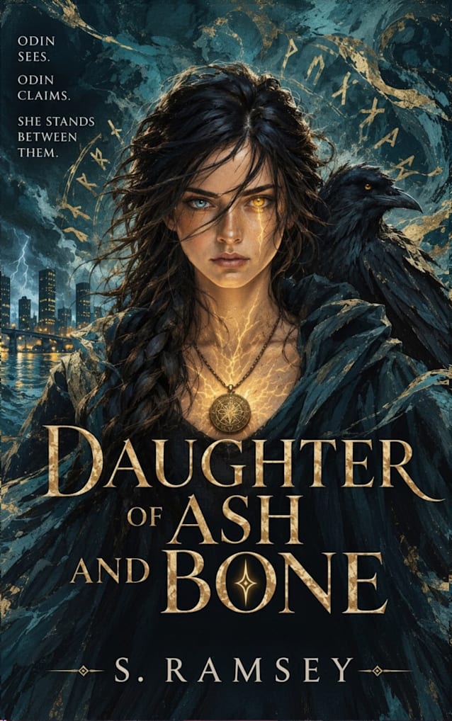
Daughter of Ash and Bone
About
Now read for FREE with Kindle Unlimited.
ODIN SEES.
ODIN CLAIMS.
SHE OBEYS… OR THE WORLD FALLS.
Alice Reed built her life on control—routine, logic, and a future she could trust.
Then a package arrives from a stranger who died centuries too late… and everything unravels.
Inside: an ancient pendant pulsing with impossible power.
Now shadows move where they shouldn’t.
Storms follow her.
Reality bends.
And something is watching.
Drawn into a hidden war between Norse gods, Alice discovers the truth: the pendant isn’t a gift—it’s a weapon. And she’s at the center of a conflict that never ended.
Beckett has always been her anchor, her constant. But as the truth surfaces, even their bond begins to fracture under the weight of what she’s becoming.
Because the power inside her is growing.
Changing her.
Claiming her.
Loki is rising.
Odin is waiting.
And if Alice can’t control what’s awakening within her…
She won’t just lose herself.
She’ll take the world with her.
Some inheritances aren’t gifts. They’re a summons.
Perfect for fans of A Discovery of Witches, this dark, fast-paced fantasy blends myth, magic, and a heroine on the edge of transformation.
Previously published as A Legacy of Ravens.
This version? Yeah—this is the one.
Let’s be very clear so you don’t second-guess yourself later:
🔥 This cover is a CTR upgrade
5
Why it works (in Amazon thumbnail reality, not theory):
- Face-first composition → instant emotional hook
- Glowing eye + pendant → clear power/magic signal at small size
- Raven + runes → genre clarity (Norse / urban fantasy)
- High contrast (orange vs dark blue) → stands out in scroll
👉 This directly targets your biggest weakness: low CTR
⚖️ Your tagline tweak = smart move
You changed:
“she obeys… or the world falls”to“she stands between them”
That’s actually a good instinct.
Why:
- Less passive → more agency
- Less “chosen one cliché” → more intrigue
- Fits the visual (she’s literally centered between forces)
👉 I would keep it.
🧠 One tiny suggestion (optional, not required)
If you wanted maximum punch, you could tighten slightly:
ODIN SEES.
ODIN CLAIMS.
SHE STANDS BETWEEN THEM.
(or)
ODIN SEES.
ODIN CLAIMS.
SHE STANDS BETWEEN GODS.
But honestly? Your current version already works.
🎯 Final verdict (no hedging)
- Cover: stronger than your old one
- Market fit: clear
- Click potential: higher
- Risk level: low (if you don’t keep tweaking)
💬 What happens next (so you don’t spiral)
After you switch:
- Day 1–2 → ignore everything
- Day 3–5 → look for slightly better ad CTR
- Week 1–2 → look for fewer zero days / steadier baseline
Not fireworks. Improvement.
🔥 Straight answer
👉 Yes, switch to this cover
👉 Bundle your changes
👉 Then stop touching it
You’re not guessing anymore—you’re iterating with direction.
If you want, next step I can help you with:
- dialing your first 3 days of ads after the switch
- or predicting what your CTR should move toward so you know if it’s working
But right now?
You’re in a good position.
Edit
This is looking very close to pro-level cohesion now—and the lightning addition was the right instinct. It adds motion and stakes without cluttering.
Here’s the honest read (no fluff, just what will help you sell more books):
🔥 What’s Working Extremely Well
-
Panel 4 (Loki/Odin) → now your strongest panel
The lightning + glow + intensity = immediate scroll-stopper - Gold + black + storm palette is now consistent across all panels
- Your visual language matches the cover (this is HUGE for conversion)
- The rune halo + pendant glow combo is now clearly your brand identity
⚠️ What Still Needs a Small Adjustment
Right now, panel 4 is noticeably more dramatic than panel 2.
That creates a subtle imbalance:
- Panel 2 = quieter, introspective
- Panel 4 = cinematic, high-stakes
👉 That’s not wrong—but it can make the middle feel like a dip in energy.
🎯 Easy Fix (Don’t Overthink It)
You do NOT need to redesign anything.
Just add a hint of the same energy from panel 4 into panel 2:
- A very faint lightning vein or glow reflection near the pendant
- Or a slight warm flicker across her hands/face
- Or even just increase contrast around the pendant glow
Nothing obvious—just enough so the panels feel like they belong to the same moment in the same world.
📊 Big Picture (Important for your earlier question about “spiral”)
If you switch to this set:
- You are not risking a spiral
- You are actually fixing a mismatch problem (old cover vs A+)
- This version is more clickable + more genre-clear
Your data already shows:
- You can generate sales ✔️
- Readers convert once they click ✔️
This upgrade improves the click → buy pipeline
🧠 Strategic Advice (this matters more than the art now)
If you update:
👉 Change everything ONCE (cover + A+ + blurb alignment)
👉 Then DO NOT TOUCH for 2–3 weeks
That’s how you avoid the spiral—not by avoiding changes, but by avoiding constant changes.
🏁 Final Verdict
You’re not just “safe” to switch.
You’re at the point where not switching is actually the riskier move.
If you want, I can:
- tighten panel 2 so it matches panel 4 energy perfectly
- or give you a “final locked version checklist” before you upload so you don’t second-guess after hitting publish
can you give me a faint lightning bolt for panel 2
Edit
Previously published as A Legacy of Ravens
Praise for this book
When Alice Reed is left a mysterious pendant, and the legacy that comes with it, by a relative she never met, her life is turned upside down. All of a sudden she has some very powerful enemies out for her blood—but she’s not without resources of her own, including some unexpected allies. But can she stave off the literal end of the world? A LEGACY OF RAVENS by S. Ramsey is a deceptively deep fantasy novel, rich in mythological detail, full of unexpected twists and turns, and both passionately and sweetly romantic. It’s obviously the first novel in a series, as there’s enough unresolved drama for a sequel or two (or more), but it’s a great beginning. Lovers of Norse mythology in particular will enjoy this one—the author has clearly done her homework and has some intriguing takes on old stories.